











Nowadays, more than 60% of website traffic comes from mobile devices such as cell phones -- if your website is displayed incorrectly on cell phones (e.g. text overlapping, buttons not clickable, images exceeding the screen), it will directly lead to user loss. Mobile adaptation is not a "plus point", but a "must pass" for website launch. This section will teach you 3 ways to check the mobile display effect, as well as how to quickly fix common adaptation problems, novice can also easily operate.
I. Why mobile display must be emphasized? 3 key data
- user habits78% users worldwide browse websites via cell phones, of which 40% users will simply close websites with "poor mobile experience".
- search engine preferenceGoogle and Baidu both use "mobile-first indexing" - i.e., they prioritize the quality of websites based on the content of the mobile version, and a poor mobile experience will have a direct impact on rankings.
- Translational impact: A well-adapted site on mobile has a user dwell time 3x longer than a poorly adapted site, with a 50% higher conversion rate for inquiries or purchases.
Briefly:Websites that don't display properly on mobile are actively giving up most of their users and traffic。
Second, 3 methods to check the mobile display effect (from simple to professional)
Method 1: Direct access from a cell phone (most realistic test)
This is the most intuitive way to simulate the browsing experience of real users:
- Tested with different cell phones: Test with at least 1-2 mainstream cell phones (e.g. iPhone, Huawei, Xiaomi), as browser rendering may vary between brands.
- Testing the core page: Focus on the following pages (most frequently visited by users):
- Home: Is the rotating image fully displayed? Does the navigation menu expand properly?
- Article pages: is the text clear (not blurry, not too small)? Does the image extend beyond the screen?
- Contact page: Are the form buttons clickable? Does the input box type properly?
- Navigation menu: does it become a "hamburger menu" (three horizontal lines icon) on cell phones? Does it expand when clicked?
- Slide & Click Test:
- Slide the page: is it smooth? Is there any lag or misalignment?
- Click on buttons / links: especially small buttons (e.g. "submit", "buy"), make sure they can be clicked accurately and do not accidentally touch other elements.
Method 2: Emulate mobile with a computer browser (quick troubleshooting)
Don't have multiple cell phones? Use your computer browser's "Developer Tools" to simulate various phone models, suitable for quickly locating the problem:
Step 1: Open Browser Developer Tools
- Chrome: On the website page press
F12button, or right-click on "Check". - Edge Browser: Works like Chrome (both have the same kernel and have the same effect).
- Safari Browser: You need to check "Show development in menu bar" in "Preferences→Advanced" and then click "Development→Responsive Design Mode".
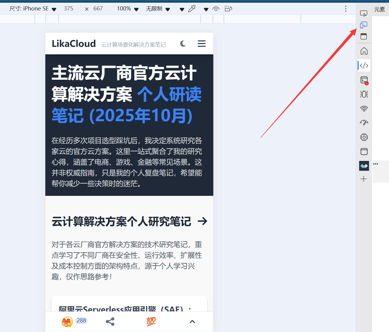
Step 2: Switch to Mobile View
- In the top left corner of the developer tools, find the 'Device Switch Button' (like the phone and computer icons), click on it and the page will change to the size of your phone's screen.
- Select a common phone model at the top (e.g., "iPhone 14" "Pixel 7"), or just enter the screen width (e.g., 375px, the width of mainstream phones).
Step 3: Examine the key issues
- the layout is in disorder: Does the text overlap? Are images truncated? Are modules misaligned?
- Element size: Are the buttons and text too small (less than 12px is hard to read)?
- Horizontal scrollbar: Whether horizontal scrollbars appear at the bottom of the page (indicating that the content exceeds the screen width and needs to be fixed).
Method 3: Testing with online tools (generation of specialized reports)
Recommended Tool:Google Mobile-Friendly Test(Google Official Tools, free)
Official website:https://search.google.com/test/mobile-friendly
Step 1: Input URL Detection
Fill in the input box with the address of your website's homepage (e.g. https://example.comClick on "Test URL" and wait for 1-2 minutes for the report to be generated.
Step 2: Interpreting the results of the report
- pass a test: It shows "The page is suitable for mobile devices", which means the basic adaptation is fine.
- Failed the test: Specific problems are listed (e.g. "text too small to read" "clicking on an element too close") and the location of the problem is labeled (click to see screenshots).
Third, common mobile adaptation problems and solutions
Problem 1: Text too small or blurry (can't read content)
- rationale: the theme is not set with responsive fonts (fixed pixel size, as in
font-size: 12px(which will appear small on a cell phone). - tackle:
- If editing with Elementor: Select the text module and in the Responsive Settings (click on the mobile icon), adjust the font size to 16px or more.
- General method: Install the plugin "Simple Custom CSS and JS", add the following code (set the font to adaptive):
@media (max-width: 768px) {
  body { font-size: 16px !important; }
  h1 { font-size: 24px !important; }
  h2 { font-size: 20px !important; }
}
Issue 2: Picture/video out of screen (horizontal scroll bar appears)
- rationale: The image width is fixed (e.g. set to "800px") and exceeds the width of your phone's screen (usually 375-414px).
- tackle:
- Ensure that the image is "Adaptive Width": in the image editing screen, set the width to "100%" (instead of a fixed number of pixels).
- When using Elementor: Select the image module, check "Responsive" in "Style→Width", and uncheck "Fixed width".
- Batch Fix: Add CSS code to force images to adapt:
img { max-width: 100% !important; height: auto !important; }
Problem 3: Buttons/links are too small and can be clicked by mistake
- rationale: Buttons that are smaller than 44×44px (Apple's official recommended minimum clickable area) and are spaced too close together.
- tackle:
- Edit buttons: In Elementor or Theme Settings, set the button "Min Width" to 44px and "Spacing" to 10px or more.
- Emergency fix code:
.button, a {
  min-width: 44px !important;
  min-height: 44px !important;
  margin: 5px 0 !important;
}
Issue 4: Navigation menus do not appear or do not expand on the phone
- rationale: The theme's mobile menu functionality is not enabled, or a JavaScript conflict prevents the menu from being clickable.
- tackle:
- Check theme settings: Go to "Appearance → Customize → Navigation" and make sure "Mobile Menu" is enabled (usually "Hamburger Menu" style).
- Troubleshooting plugin conflicts: Temporarily disable all plugins and test whether the menu returns to normal (if it does, enable plugins one by one to find the one in conflict).
- Replace the navigation plugin: If the theme menu is more problematic, you can install a special mobile menu plugin (such as "Max Mega Menu") to automatically adapt to cell phones.
Fourth, the novice must know the principles of mobile optimization
- "Mobile First" Design Thinking: When creating a website, consider the mobile display before adapting it to the computer (not the other way around). When editing in Elementor, click the "mobile icon" to set the mobile style first, and then adjust the desktop style.
- Streamlining content for mobile: The small screen of cell phones eliminates the need to display all computer-based content (e.g., complex sidebars can be hidden, leaving only the core navigation and content).
- Regular testing: Every time you update a theme, plugin, or publish new content, take a quick look through it on your phone to avoid new content breaking the fit.
wrap-up
The core of the mobile display check is to "put yourself in the user's shoes": imagine yourself browsing a website on your cell phone, and whether you can easily read the content, click buttons, and find information. Through mobile testing, browser simulation and online tools, we can cover more than 90% adaptation issues, while common problems (such as fonts, images, buttons) can be quickly fixed with simple settings or code.
After ensuring that the mobile experience is good, your website can truly reach all users and pave the way for subsequent promotion and conversion.
 English